Color Envy

To Shine or Not to Shine…

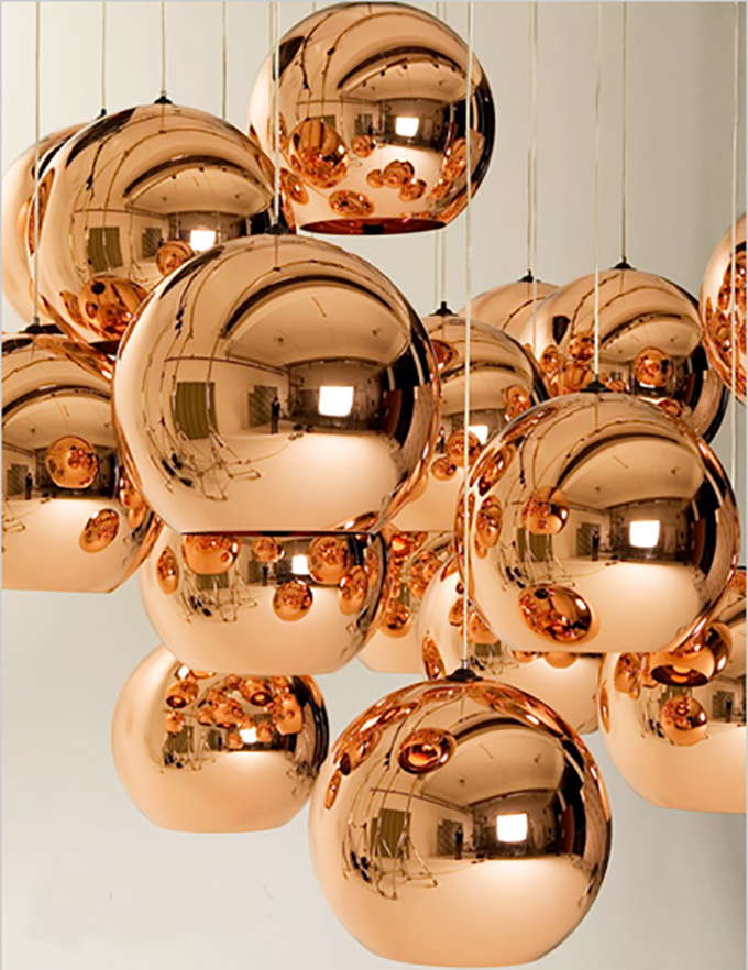
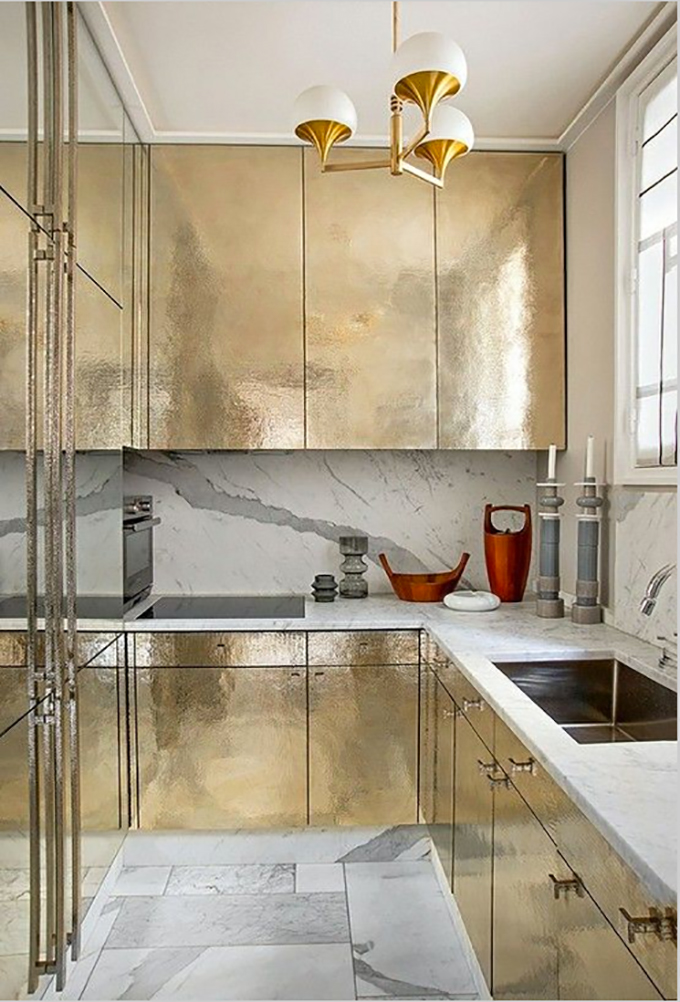
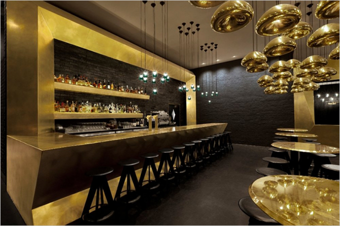
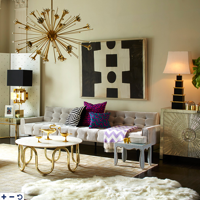
To shine or not to shine–that is the question! Let’s talk high gloss today:

I frequently preach the gospel of making a design statement in this blog. After all, one must take a bit of a design chance in order to achieve nirvana. Design greatness often means pushing the boundaries of good taste and this sometimes means breaking the “rules”. One of these rules has always been that walls should be painted a dignified satin or eggshell finish.

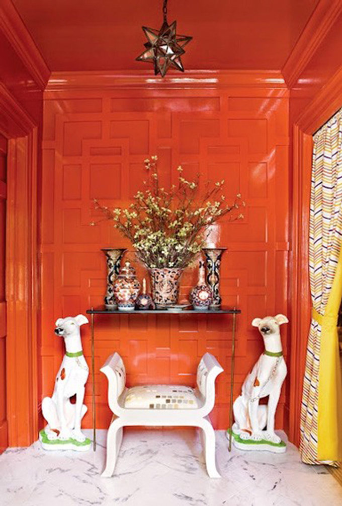
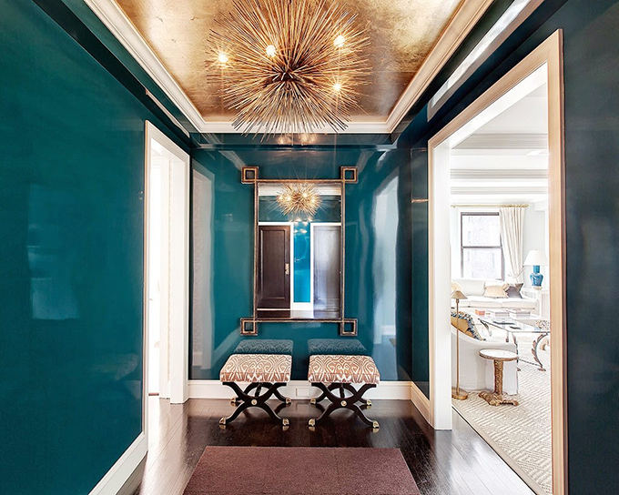
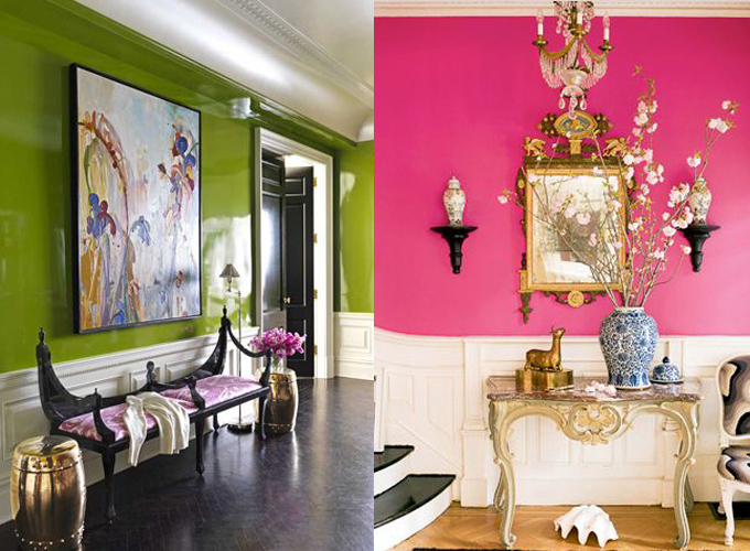
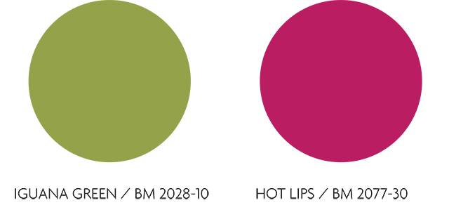
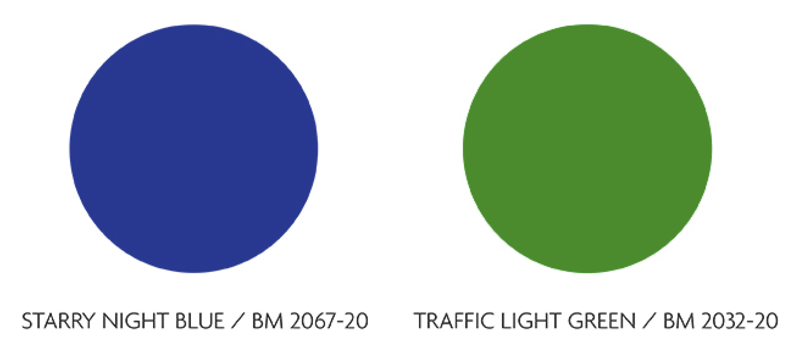
Many top designers such as Miles Redd and Steven Gambrel have discarded those rules and have glossed up everything from walls and ceilings to cabinets and floors. Of course, there is a method to their madness. One must choose carefully the right room and color before going crazy with shine.  For my money, libraries, dining rooms and powder rooms are perfect foils for high shine glamour. Jewel tone colors such as sapphire, garnet and malachite or the stark contrast of black and white look spectacular when done in a high gloss finish.

Whatever your high gloss fantasy is make sure you use a painter experienced with this type of application. High gloss finishes show every imperfection, so excellent preparation is key.

Here are some of the ways we are inspired by bold high gloss interiors and we’ve gone ahead and picked out Benjamin Moore paint swatches to match. Go ahead and let it shine!

The Pink Pagoda // Christina Murphy
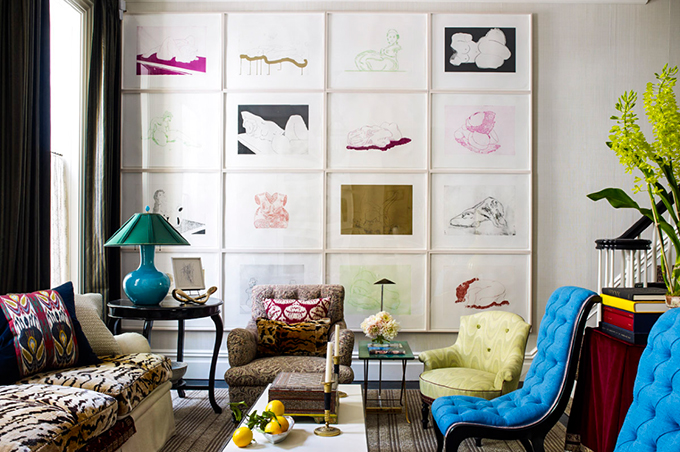
Green and Pink High Gloss Walls green pink BMMiles ReddMiles Redd High Gloss impact wallsMiles-Redd-colors
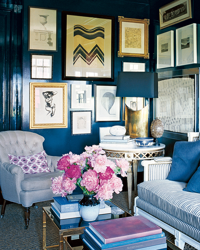
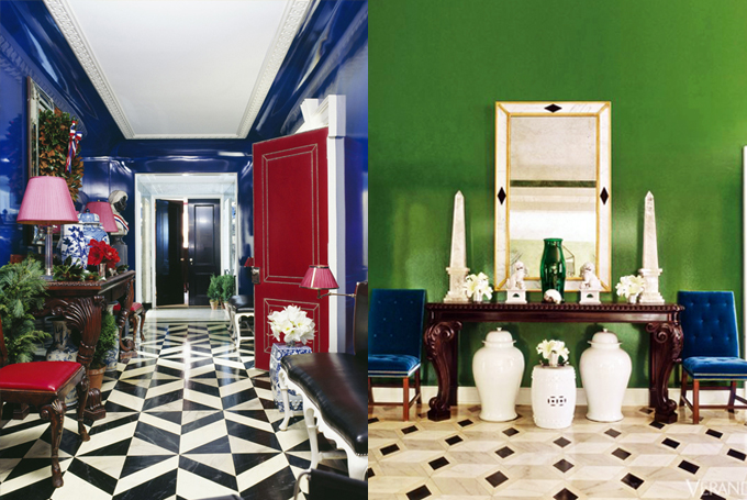
Beautiful orange lacquered wallsOrange Lacquered Wallsorange


Yellow Fever- Spring 2015 Design Trends

Jonquil, marigold, buttercream. What’s in a name, you say? They’re all variations of this Spring 2015’s design trend color, yellow.

Yellow, in my experience, is one of those colors people either love or hate. But used correctly, nothing brings eternal summer to a room like it. Try a jolt of yellow on a wall, pillow, or accessory and watch your room glow.

Jonathan Adler santorini yellow lampWe love this Johnathan Adler Santorini Table Lamp, a sunny and bright accessory.

Eero Saarinen Knoll Womb chair A piece that will never go out of style, the Eero Saarinen designed Womb Chair for Knoll.

Yellow: Spring 2015 trendsAnd the luxurious yellow in this Alex Papachristidis designed Manhattan bedroom is right on point.

Follow our Spring 2015 trend board on Pinterest for more of what’s trending and what we love!


2015 Interior Design Trends

Happy New Year to you all!  I don’t know about you, but the New Year always prompts me to be thinking about sprucing up my wardrobe and home and work spaces. And although I never advise anyone to follow trends, we do want to feel fresh, modern and current.  So with that in mind, On Madison has identified design trends that will perk up your spaces and help you take on 2015 stylishly.

METALLICS:

MetallicsI don’t think I ever tire of metallics whether they be brass, chrome, nickel or copper.  Metallics add richness and sparkle to a room and the best part, they are neutrals.  Mix them with virtually any color or design style. 2015 is especially about copper. Try mixing some copper with creams, chocolates, plums or chartreuse greens!

Metallics Metallics-2

LUXE MATERIALS:

Lux MaterialsMaterials such as marbles, leathers and lacquer add glamour and richness to a room.  Use them in unexpected ways such as hi gloss lacquer on the ceiling, leather tile “rugs” on the floor or the back of a bar.  Everyone needs a little glamour in their life.

Luxe-Materials-3 Luxe-Materials-2 Luxe-Materials-1GEOMETRICS:

GeometricsI didn’t much care for math, but I’m crazy for circles, squares, hexagons, triangles in configurations adorning rugs, draperies, accessories and artwork.  Geometrics have a timeless quality yet feel incredibly modern, too.

Geometrics Geometrics Geometrics1960’s MOD:

1960's ModI’m probably dating myself, but, darn, I love that decade.  2015 will continue to see furnishings, fabric, lighting and accessories inspired by that groovy era.

60s-Mod-1 60's-ModGALLERY WALLS:

Gallery Wall2015 will see a trend toward creating gallery-like displays of artworks and collections.  The way art is displayed can elevate even a humble print.

Gallery-Wall-2 Gallery-Wall-1RICH COLORS:

MarsalaEvery year Pantone selects their Color of the Year.  This year’s color is Marsala (Pantone Color 18-1438), a rusty pinky tone that could feel a bit dated if not paired with the right colors.  Try it with crisp whites, driftwood grays, yellowy greens and even orchid to keep it feeling modern.

Marsala Marsala-Pantone-Color-2015_1 Marsala-Pantone-Color-2015


1 2 3 4 5 6 7